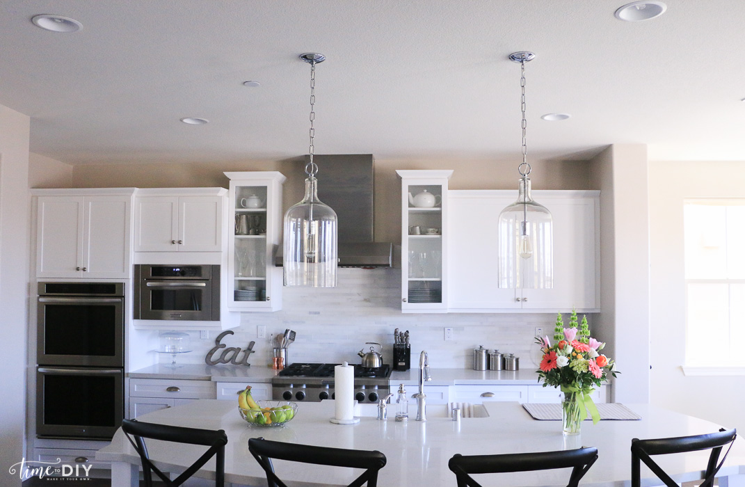
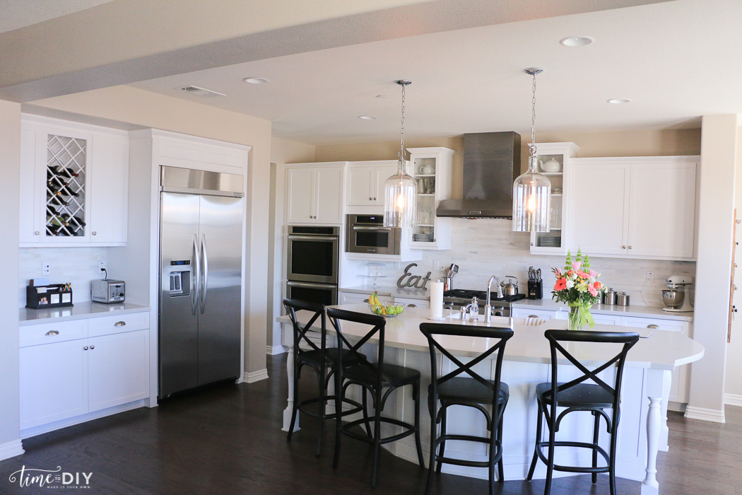
 Our gray and white kitchen design! This was so fun. Sometimes my head was spinning because I’m a visual and must-consider-all-the-options-type person (Pinterest and Houzz are a blessing and a curse!). And then other times I knew exactly what I wanted, but the builder didn’t have that option. But, overall, it was a dream to design our kitchen.
All the details and links are at the end of this post, but I will cover a few of our choices (and why).
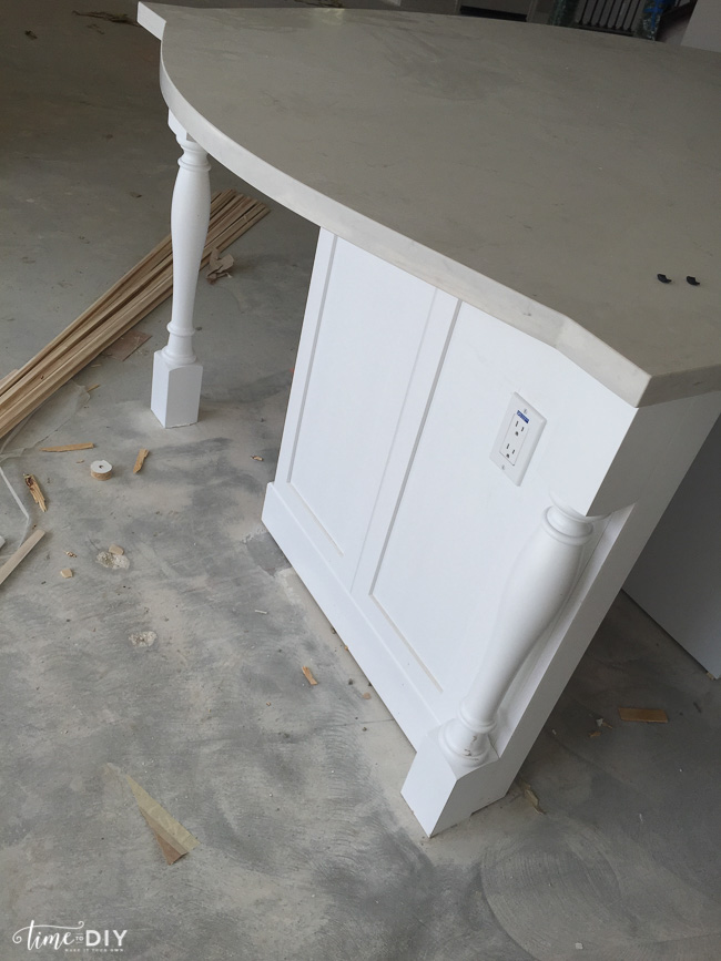
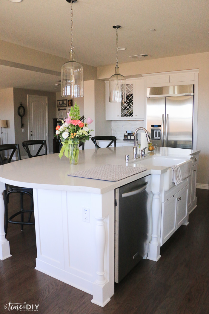
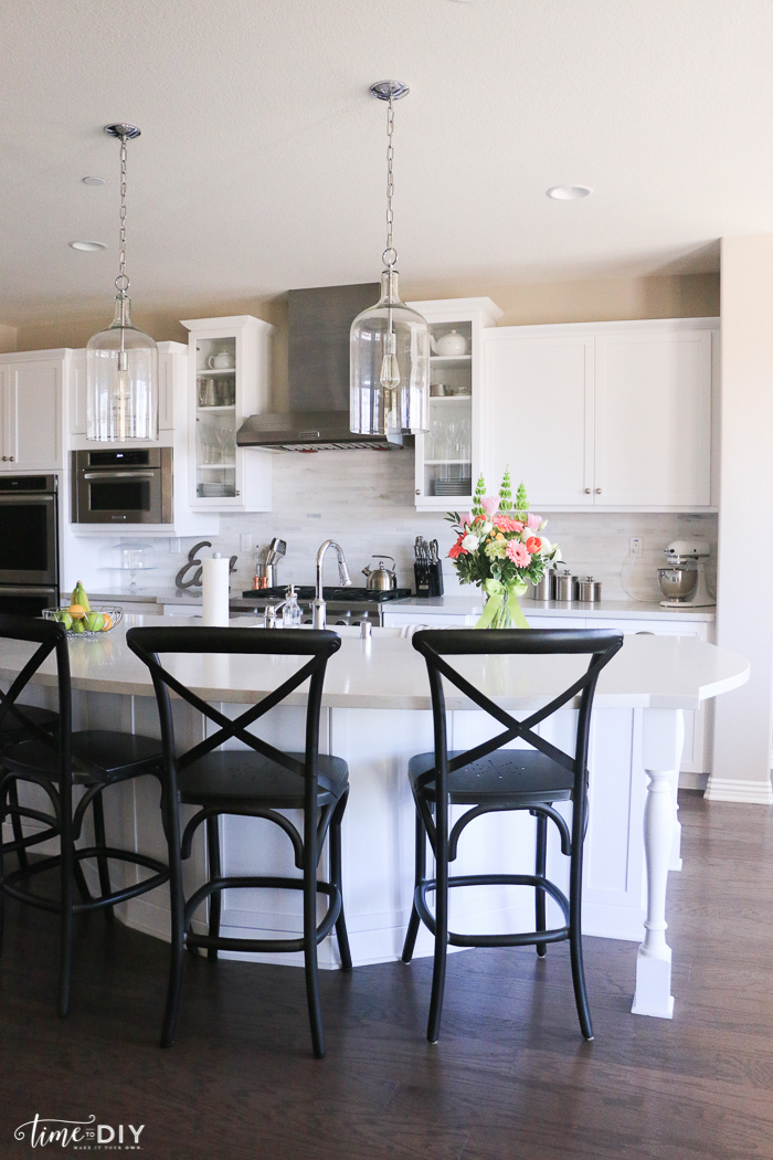
We liked rustic glam/French country cottage/farmhouse/industrial styles and had a vision of cottage-style cabinets, but that wasn’t a builder option so we went with the white Shaker, and that was also the only way to get real wood. I wanted the island to be a different color, like a piece of furniture, but all the cabinets had to be the same color in the whole house so guess who will be painting the island? That’s okay since I heart DIY. I’m thinking something in the gray family.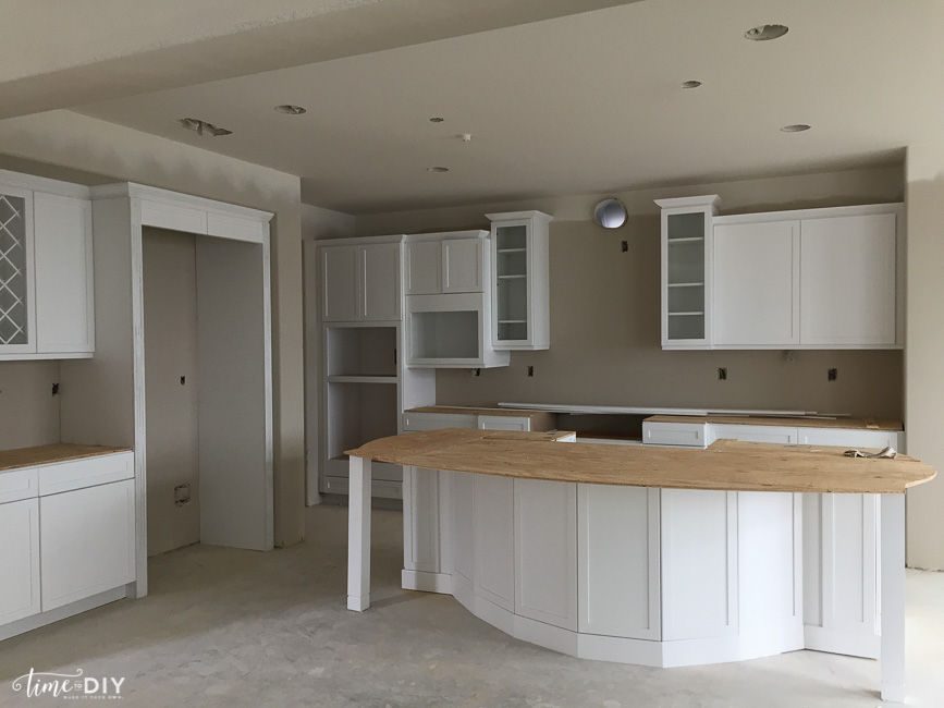
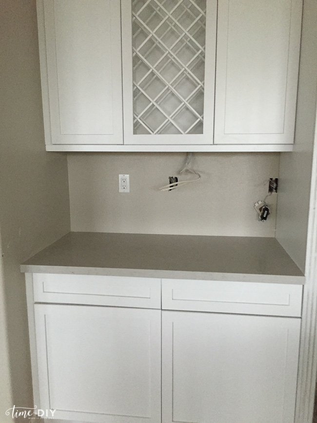
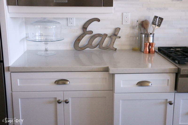
We chose Caesarstone Quartz for the countertops because it looks a lot like marble, but it’s easier with littles – marble supposedly stains more easily.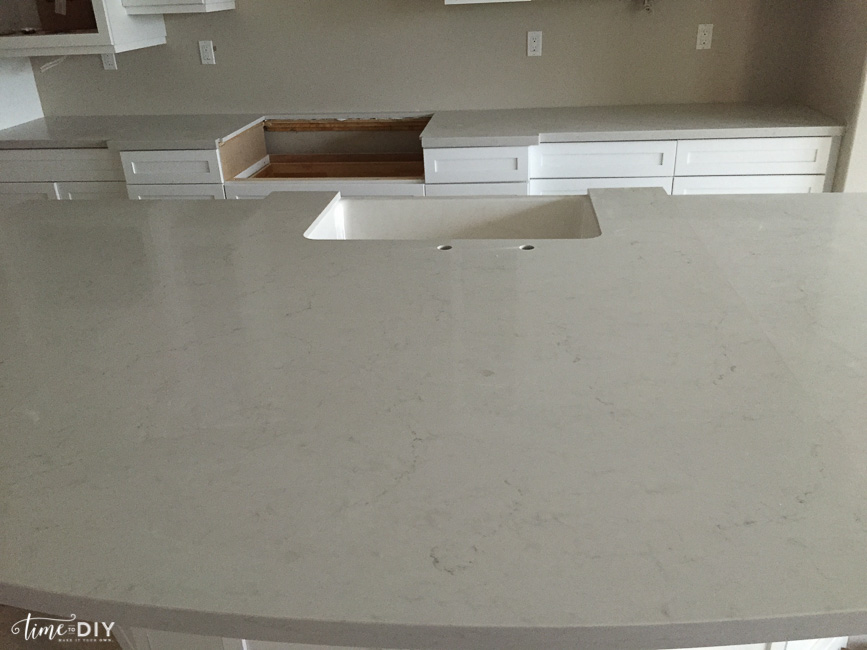
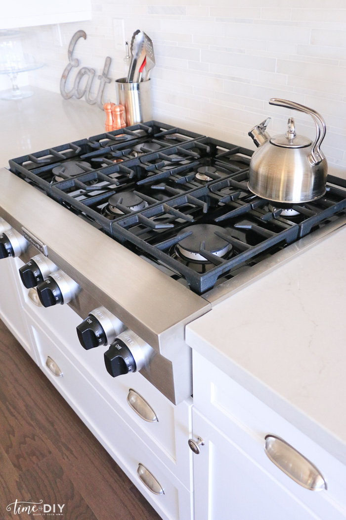
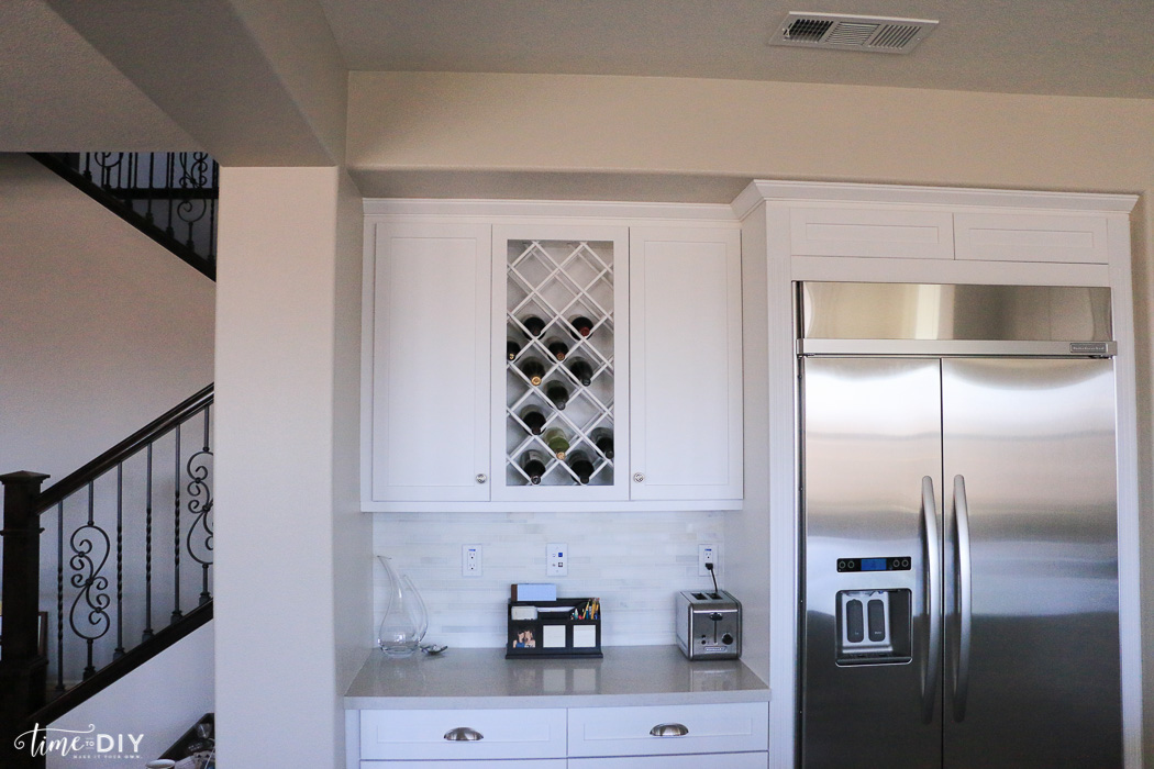
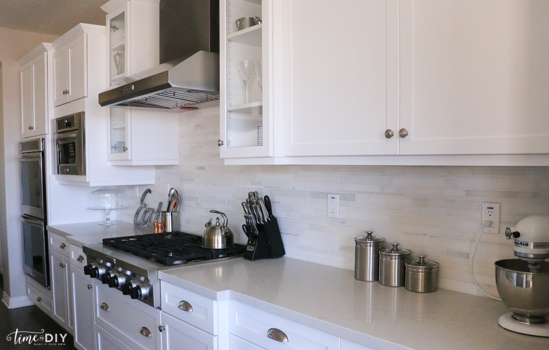
Now, the backsplash. We were going for the rustic glam look and wanted a grayish stone so we chose this: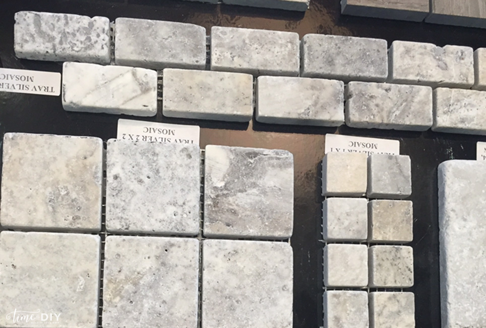 Beautiful and mostly gray, right?
Except that it looked like this after it was installed: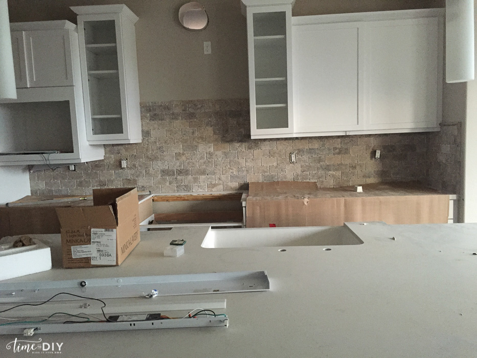
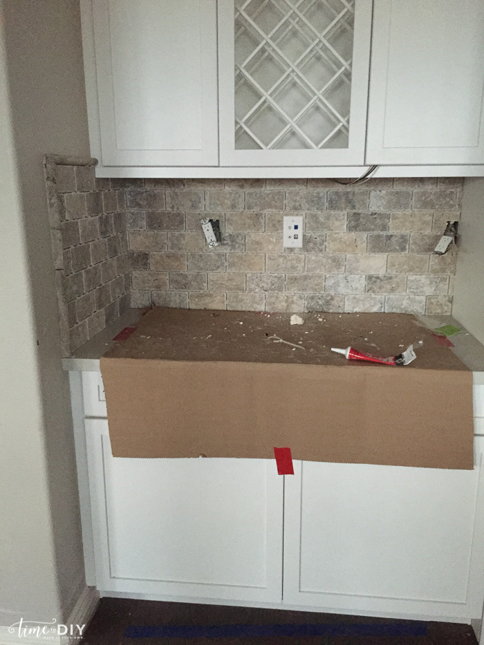
We really wanted lighter/whiter/grayer so we had them switch it out. It didn’t cost anything more because they installed our master bath and guest bath tile floor the wrong direction so instead of redoing that, they redid the backsplash instead.
The tricky part was that it was two weeks from closing so we had to pick a material that was readily available. And the London grey counter is a warm tone, and a lot of what we were picking had cool tones. We finally found a marble stackstone that had warm tones and was available.
We were a little nervous about making the switch (what if we ended up liking the first one more?), but as it started going in we were relieved.
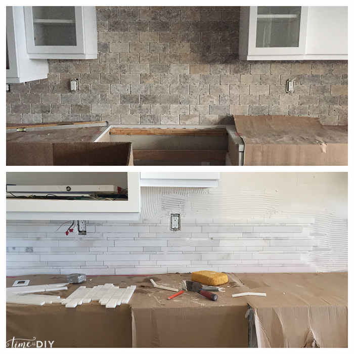
It initially looked a bit more modern than I wanted, but I loved the white marble against the cabinets and knew I could still pull in some industrial farmhouse style.
Like changing out the light fixtures…these were what the the builder put in, which didn’t work. 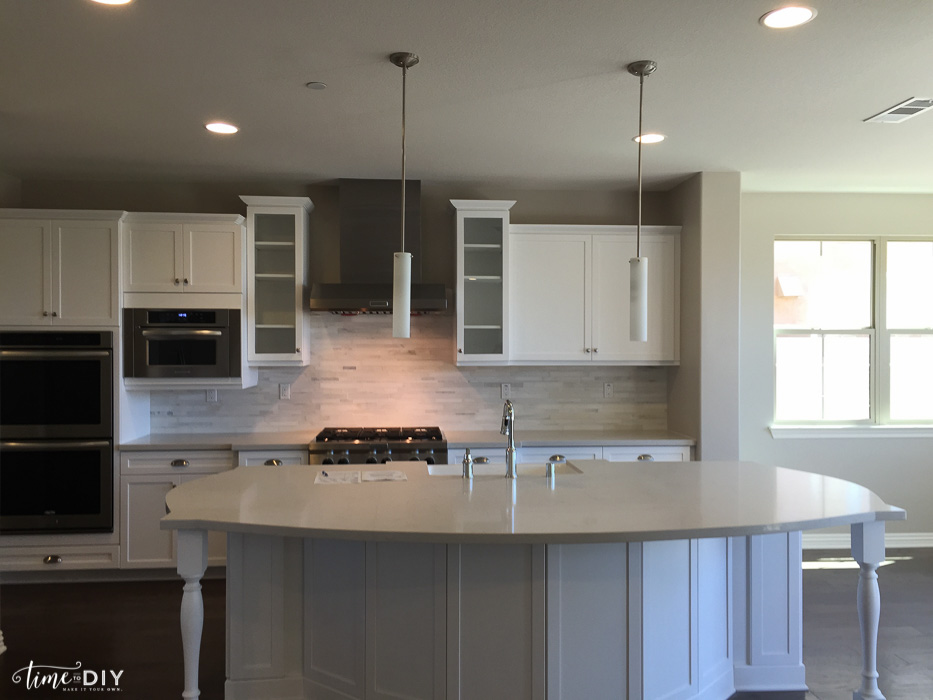
So we switched them out with some 23-inch high Capri Pendants.
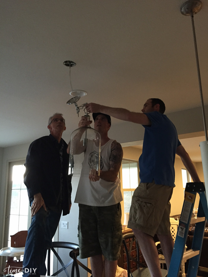
They looked huge when we pulled them out of the box, but they needed to be bigger since there were only two pendants, and the glass makes it look substantial without overpowering the space. The best part was when they were up my Dad said, “The chain ties in with your chrome faucet.” Love that he noticed!
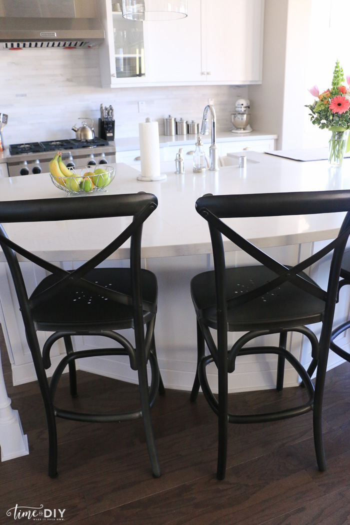
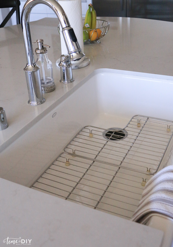
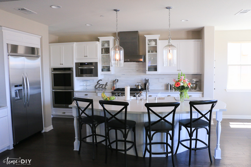 Speaking of the faucet, I went back and forth on brushed nickel vs. chrome and I’m so happy I went with chrome!
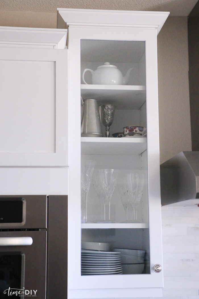
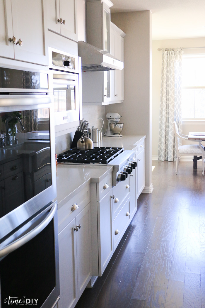
The kitchen isn’t done (I need to paint the island, find a rug, rearrange what’s in the glass cabinets, etc.), but it’s coming together:

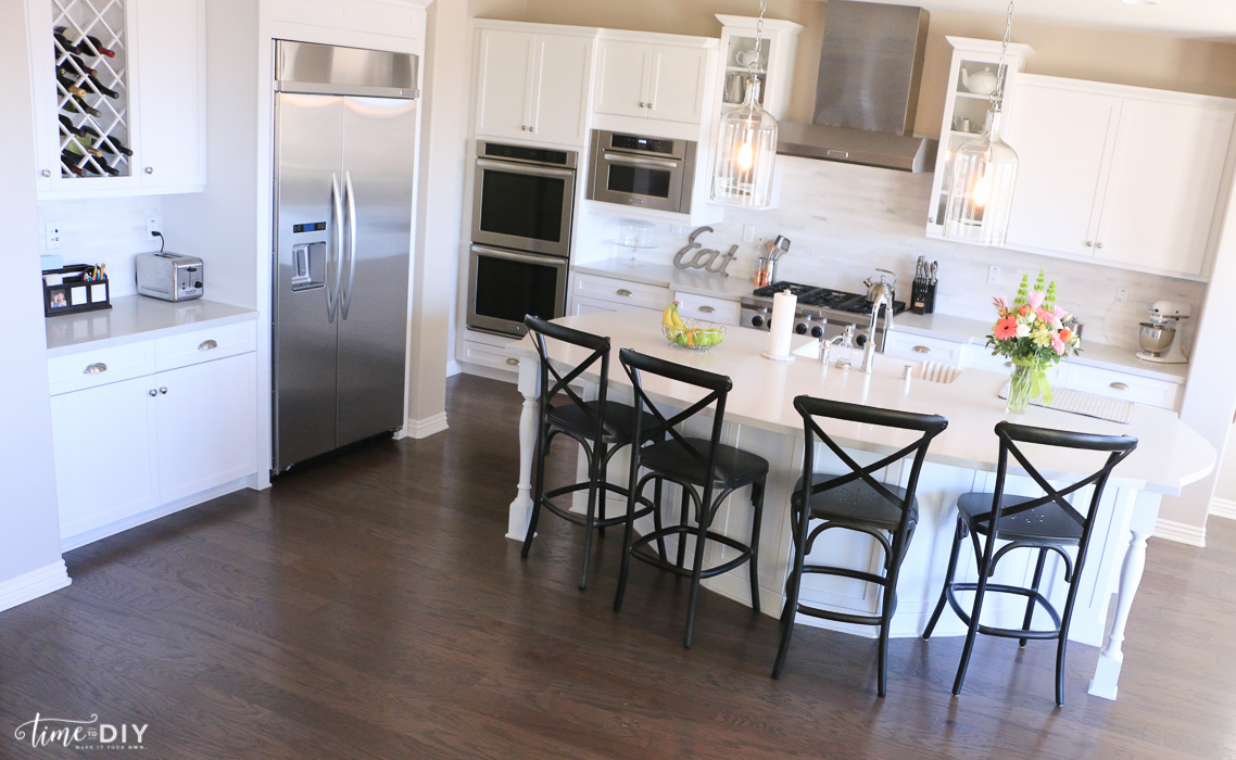 Kitchen Details
Cabinets: White Shaker – No link because we weren’t impressed by the quality/installation
Hardware: Brushed nickel cup pulls and knobs
Backsplash: Manhattan Polished Stackstone Mesh – Arizona Tile
Countertops: London Grey Caesarstone Quartz
Paint: Siberia (CL 2852W) Frazee
Sink: Kohler Apron-front
Faucet: Moen Chrome
Island Pendants: Capri 1-Light Pendant – Home Decorators Collection
Counter Stools: Metal Madeleine, Gun Metal – Restoration Hardware
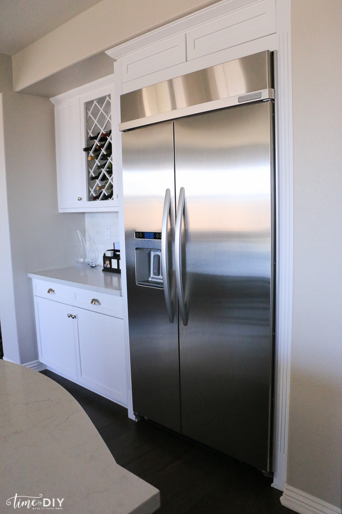
KitchenAid Appliances – Sears
Built-in side-by-side refrigerator
Other Stuff
Paper towel holder – Crate and Barrel
Fruit bowl, Soap dispenser, Tea pot – Home Goods
Cake stand – Pottery Barn
Knife block, Canisters, KitchenAid mixer – Macy’s Home



Love. Love. Love. What are you doing in my dream kitchen?! Honestly you guys did a great job. Super fresh and open. Congrats!
Aw, thank you! 🙂
Oh this is gorgeous!!! Looks so fresh and clean! Can’t wait to see more of the new house!
Thank you, Amanda!!